What is Responsive Web Design?
Responsive Web Design is the term given to a Website that has been designed to be viewed on devices of all shapes and sizes. Whether the user is viewing the website on a mobile phone, tablet, laptop or desktop computer the website dynamically changes to display a version of the site that works for the screen size it is displayed on.
From a designers perspective, different ways of interacting with the website also have to be catered for. Some users will be using a mouse and keyboard to browse the site, whilst others will be using touch. What seems intuitive from the perspective of someone with a mouse pointer is often not easy to use for someone with their finger tips.
History
To put the rise of Responsive Web Design into perspective, a brief history lesson is in order. Before mobile phones and touch screens a website had one job: to display beautifully on a standard desktop computer screen, and some of them struggled with that! Once mobile phones became common place it was good practice to have two different versions of your website - one for standard users and one for mobile users. These websites were separate things - you would be seeing an entirely different website on your phone than when you were using your computer.
Mobile technology moved on again and tablets were now a consideration, and suddenly having just two versions of the website was not enough to cater for the huge variation in screen sizes that are on the market. The solution to this was Responsive Design. Instead of having a rigid design or two that would work at a set screen size, the website will now scale up and down, showing a customised version of the same website that is guaranteed to be readable and accessible on whatever device is being used. From a web designer's perspective it is a fundamentally different way to approach creating websites and the old inflexible methods had to be changed.
A Real Example


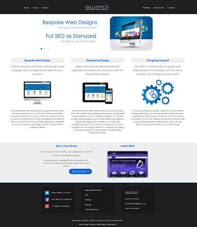
The images above are of two different sizes of the same website - the one you happen to be viewing at the moment! The left image shows the website as it would be displayed on a traditional desktop computer. The right, long image shows how the content would be arranged on an average size mobile phone.
The mobile view has a different navigation menu, taking into consideration users who may be using touch screen devices. The content has changed format to better fit the smaller screen but no detail has been lost. Responsive Design does not cut down on functionality and information available, it changes how it is displayed.
Why do I need Responsive Web Design?
The straight forward answer to this is because people want to view your business website on whatever device they are currently using. If it doesn't work they are not going to find a desktop computer to view it on - they are going to leave and not learn about your business or buy your products.
This isn't the only reason however, there are other technical reasons why Responsive Design is the way forward. Firstly, Google knows whether your website is Responsive or not and it is one of the factors it uses when deciding where you rank for searches. Having a website that doesn't work on mobile devices is, in Google's eyes, bad and so you drop down their list.
Responsive Design is also about page loading times. Users who are viewing your website on their mobile phone while they are out and about do not always have a brilliant internet connection so making sure your website loads with the least amount of data possible is important. Images can be optimised, code streamlined and however pretty that flash animation from 1999 is it's not helping your users interact with your website!
Are you considering Responsive Design?
If you need a Responsive website for your business Gillistics Web Design are happy to help. You can view our Web Design Services or Get in Touch.

Back to the Blog Archives >


 Follow Gillistics on Twitter
 Like Gillistics on Facebook
 +1 Gillistics on Google+